Case Study: XYZ Roofing
XYZ Roofing, our demo website, offers a glimpse into how we can enhance your business. Although fictitious, it’s inspired by a real company in Canada, where we’ve modified details for privacy.
Throughout this case study, we’ll provide insights into the strategies behind upgrading web design, improving performance, integrating SEO tactics, and perfecting conversion methods.
Revamped XYZ Roofing Design to Enhance User Experience

The old website has a classic vibe and is even nostalgic.
Let’s be real. In today’s online world, seeing an outdated site can inadvertently raise concerns. After all, who wants to risk sharing sensitive information with a site that doesn’t inspire confidence? It’s a valid argument, don’t you think?
That’s why the fresh, updated look is so important—it’s modern and radiates credibility. A business that invests in its appearance exudes trustworthiness from every angle.
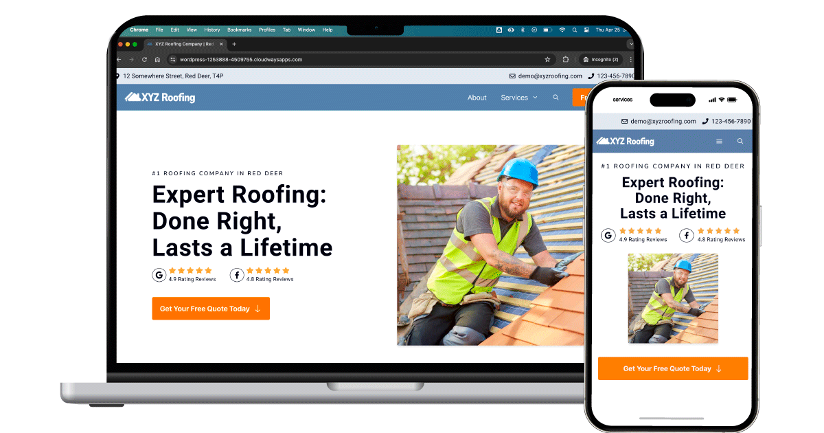
For now, let’s shift our attention to another crucial aspect of web design: mobile-friendliness or responsiveness. Rest assured, the new design is fully optimized for mobile devices, ensuring seamless browsing experiences across all screens.

Here’s the deal:
Most web dwellers use their mobile devices to surf the internet (I’m guilty). So, if they check out your business website and it’s not mobile-friendly? Well, chances are they’ll bounce back to the search results and click on your competitors instead.
That’s not our goal, is it?
Now, let’s pause for a moment.
Using your phone, visit your business’ website.
- Can you read the texts without zooming in?
- Can you press buttons and links effortlessly?
- *Do you have to move the screen around (left and right) to navigate?
If you answered ‘no’ to the first two questions and ‘yes’ to the last one, you’re probably losing money without realizing it.
*Usually, when you’re on your mobile, you scroll up and down, not side to side, right? At least, that’s the norm, though there might be exceptions.
Improved Website Loading Efficiency to Reduce Bounce Rate

Their website is already fast. Yet, we wanted to go above and beyond.
So, just like any optimization nerds, we propelled it into hyperdrive, pushing the boundaries of what’s possible. In essence, we went beyond the ordinary to redefine the extraordinary.
You might be wondering why it even matters.
Here’s the thing:
It’s a known fact in the web world that over half (53%) of website visitors are likely to “abandon ship” if your website takes longer than 3 seconds to load (Google Data, 2016).
In short, slow websites are costing you money.
Maximized SEO to Improve Website Visibility

Even though this demo site isn’t indexable, SEO remains critical for any website. Without optimization, it’s like having a shop in a remote alley—no foot traffic means no customers. By prioritizing SEO, we ensure our business is front and center on Google’s radar, attracting potential customers.
Engineered for Clicks that Lead to Profits (Conversion Optimization)
Conversion is the crux of it all—the ultimate goal.
Because here’s the thing:
A website alone won’t fill your pockets; even a beautifully designed website isn’t sufficient. What matters most is turning those clicks into paying customers. It’s the ethos of Lux Digital, after all.
And guess what? Everything mentioned earlier? It’s all geared toward boosting conversion rates.
Above the fold
The area above the fold reigns supreme—it is where users often spend most of their time. In fact, studies show that up to 80% of website engagement occurs here (Nielsen, 2010).
That’s why we’ve dedicated ourselves to optimizing this crucial space, ensuring it showcases the most vital elements of your website’s purpose.

For a better explanation, I numbered and coloured the parts of the screenshots.
1. Clear and concise headline
When users land on your homepage (or on a landing page), they should instantly understand what your business offers. Without a clear headline, even a visually appealing, fast-loading, and optimized website won’t hold their attention.
Ensure your headline clearly states what your business does to prevent users from clicking away.
For this project, we revamped the ambiguous headline “Welcome to XYZ Roofing” to “Expert Roofing: Done Right, Lasts a Lifetime,” clarifying their business’s focus and ensuring visitors know exactly what they offer.
2. Dominant Call to Action
After learning what you offer, you should present an option for the next action they can take. That’s the purpose of a CTA or Call to Action.
Without a CTA, visitors may be unsure of their next steps, leading to missed opportunities for engagement and conversion.
For the XYZ Roofing project, we created a button that includes the crucial factors to consider in a CTA: an action word, conciseness, a sense of urgency, personalization, and a value proposition.
Here’s more:
We’ve ensured the button stands out with a prominent design. It’s large and vibrant, following the best practices in user experience and conversion optimization to attract attention. When users land on your website, it should be the first thing they notice.
Before we proceed, just a refresher, here’s the screenshot again:
3. Contact details
When considering contact details, these elements might divert attention from the primary CTA, “Get Your Free Quote Today,” right? However, since both serve the same purpose, I believe it’s okay in this scenario.
Even then, contact details are only subtly integrated compared to the more dominant CTA button. Moreover, considering the concept of choice overload, I’ve consolidated the three numbers into one.
Providing too many options can lead to decision paralysis and, ultimately, fewer actions users take—meaning less revenue. Therefore, limiting choices ensures your prospects aren’t overwhelmed by analysis paralysis.
4. Social Proof
Incorporating elements like Google reviews into your above-the-fold section can greatly enhance credibility. Positive reviews gently nudge prospects to take action and click on your CTA.
5. Real person
In service-oriented industries like roofing, showcasing a real person helps establish trustworthiness. It assures users that there’s a genuine individual behind the business, fostering trust and making it more likely for them to choose your services.
Other parts of the page
Though the above-the-fold section holds significance, neglecting other page elements isn’t advisable. Each part contributes to the overall user experience.
Multiple CTAs throughout the page

Adding a call to action in different places on the page helps more people see it and makes it easier to decide to take action, like signing up or buying something. It’s like giving them little reminders to take the next step while reading.
More Social Proof (Testimonials)


As users scroll down, additional social proof, such as testimonials, addresses their doubts and objections, encouraging them to take action. These testimonials serve as reassurance, nudging users towards deciding to hire you.
Streamlined Form


In the fast-paced realm of the internet, user attention spans are short, necessitating a simplified approach. Our form comprises only four input fields, with the final one being optional, ensuring a seamless user experience. (Depending on your business, you can remove the email field to simplify it further.)
However, while this streamlined format reduces friction, it also implies a need for additional effort in gathering comprehensive information to provide an accurate quote.
The choice between a simple or detailed form depends on your business needs and preferences.