Case Study: Beyond Vinyasa
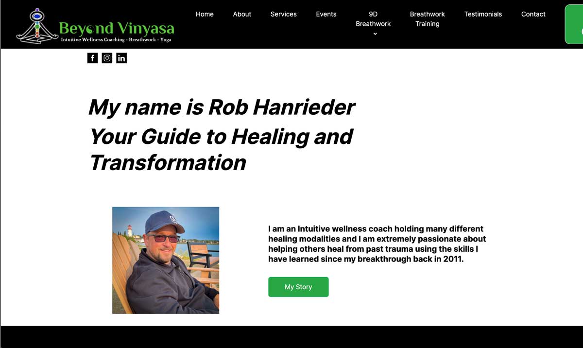
Beyond Vinyasa, Rob is an intuitive wellness coach with big plans for his business. One of them is to take it online, so getting it to show up on Google is the first step.
In this case study, you’ll learn how to rank #1 on Google for your branded search, speed up your website, and optimize for conversions.

What to expect?
Prefer to watch a video?

Rebuild using WordPress
I first redeveloped the website using WordPress since the old one was built with MailerLite’s website builder. Honestly, I didn’t even know MailerLite had a website builder, and it’s… well, not great.
So anyway, why WordPress?
First, I’ve got over seven years of experience with WordPress, so it’s a breeze for me. However, aside from my selfish reasons, it’s the most customizable option compared to other website builders. By customizable, I can quickly write my own code to improve your website without relying on countless plugins.
By the way, WordPress is a CMS (Content Management System), not a website builder.
If you’re thinking about DIY-ing your business website, I’d recommend WordPress. Sure, it has a bit of a learning curve compared to website builders, but once you get the hang of it, it’s no big deal, and your website will perform way better.
Let’s put a pin in that and tackle the main problem at hand…
How to show up and rank on Google?
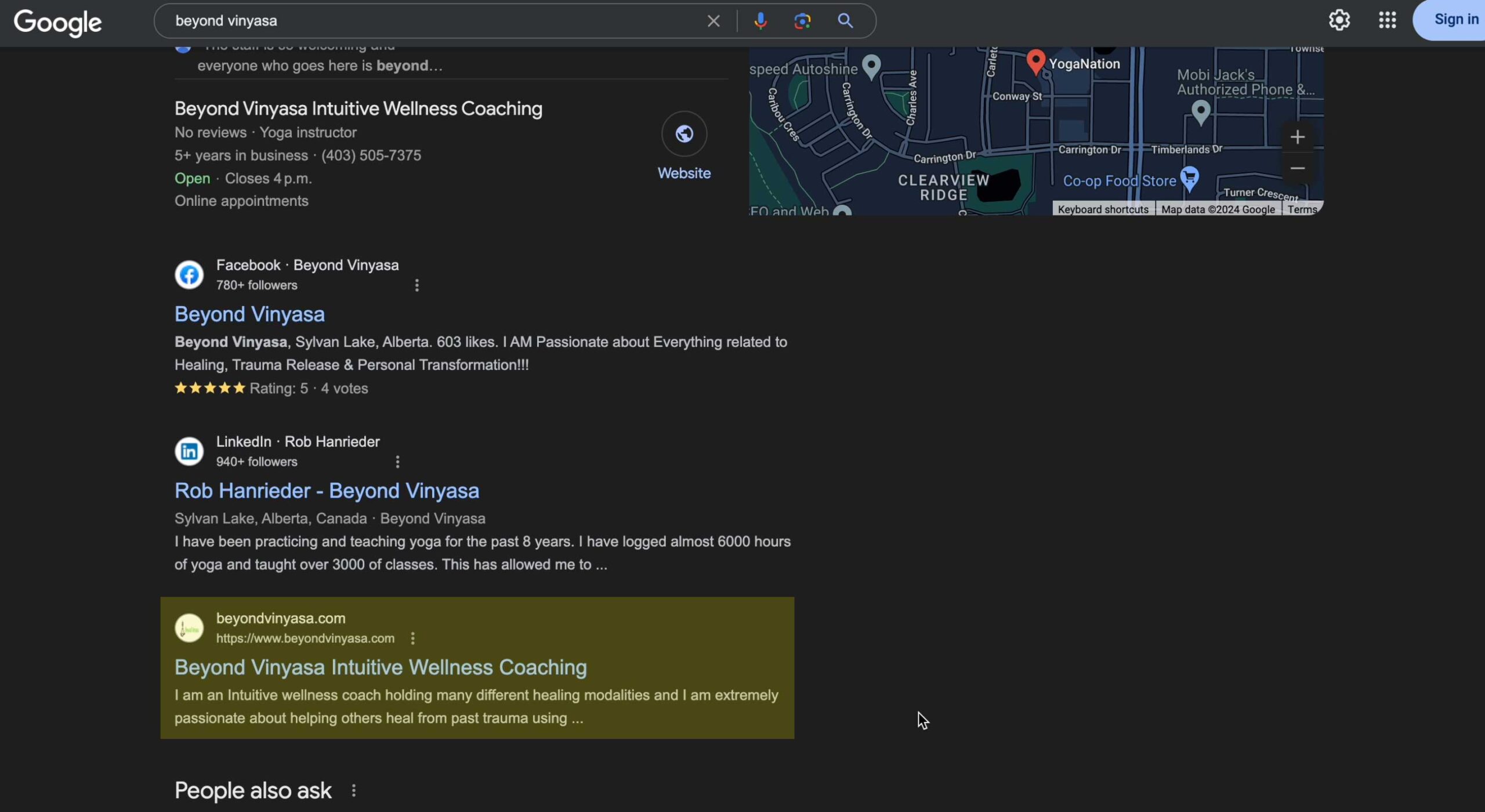
My client’s main issue was that his website wasn’t showing up on Google, or at least not as the top result for a branded search. That’s a red flag for anyone searching for his brand online.
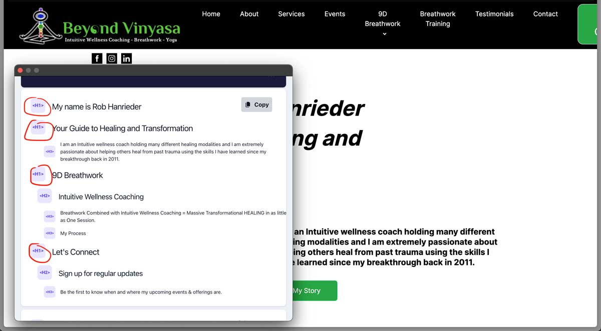
There could be a few reasons for this. However, the bottom line is that the website’s SEO was a mess. It had multiple H1 tags, no alt texts for images, an unclear main keyword, no metadata, etc.
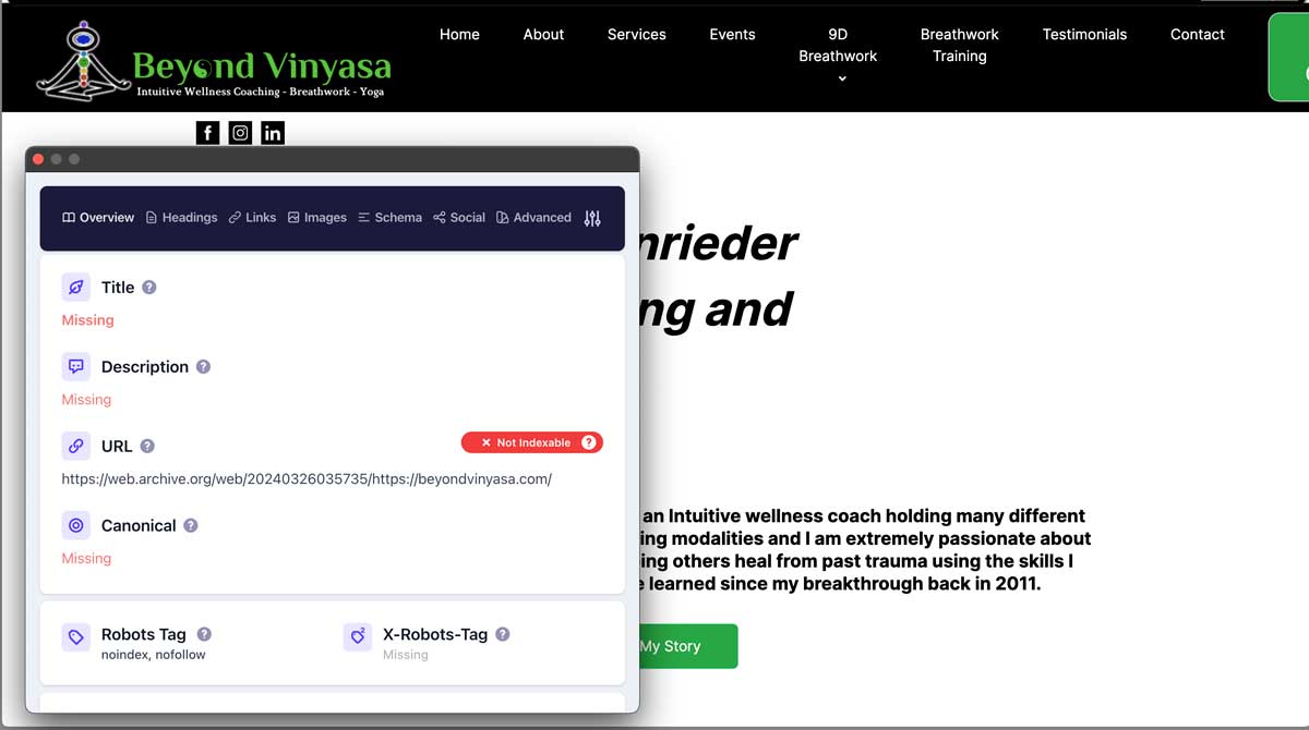
The biggest problem was the multiple H1s.
Think of it like this…
Having varied H1s on a page is like a concert with multiple bands playing different songs simultaneously, creating chaos. The audience can’t focus, and the message gets lost. Similarly, multiple H1s confuse search engines and users, making it hard to understand the page’s purpose.
In short, make sure you have only one H1 tag per page.
Ideally, your H1 should include the primary keyword you want to target. So, take some time to do keyword research and figure out the best target keyword for your business.
All your pages should also include a meta title and meta description. Although the meta description isn’t as critical as it was in the past, it’s still beneficial to have them.
Here’s more:
Remember to add alt text to all your images, describing them as if you’re explaining them to a blind person. This is important not only for SEO but also for accessibility.
For the homepage, ensure your main keyword (and brand name) is included in your H1, meta title, and meta description. Then, sprinkle it naturally throughout the page.
But be careful—don’t just cram in keywords for the sake of it. That’s called keyword stuffing, which could penalize your site by Google. In short, your website won’t appear in search results.
I’ve put together a quick tutorial for Squarespace, Wix, and Wordpress to help you fix these common issues in the video above.
Here’s the result for my client’s website…
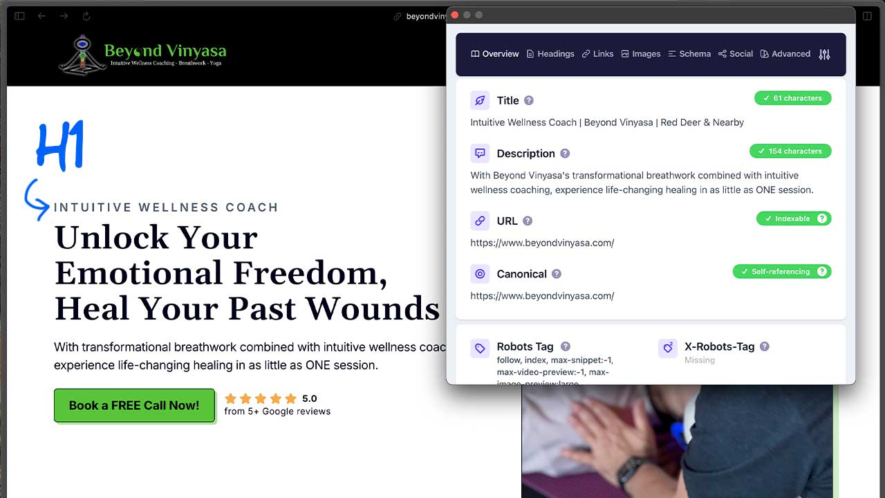
I used CSS to disguise one H1 as a pre-headline, including the main keyword and proper meta titles, descriptions, and alt texts. I also added schema for all the pages, created a proper website structure (sitemap), and set up internal linking, among other things.
Yes, it’s a lot of work;
With the technical SEO sorted, all we had to do was wait.
If you want to maximize conversions, switch to a premium website tailored to your business.
Book my Meeting Today!While waiting, let’s work on improving other aspects, shall we?
Optimize for Conversion
Next problem: It’s not optimized for conversion.
If you’re unfamiliar with the term, conversion is the action your visitor takes, such as booking a call with you or purchasing your products or services.
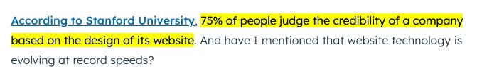
One key factor for conversion is the overall design. It’s a trust factor. According to Hubspot, or Stanford University, 75% of people won’t do business with you if your website looks terrible.
Given the limitations of MailerLite’s website builder, the design was subpar, however my Rob did a great job within those constraints. So, anyway…
To be fair, ugly and outdated websites are rare nowadays because you can technically get away with cheap (and sometimes free) templated websites that look decent.
Here’s an example that sets off an inner alarm to avoid the website at all costs.
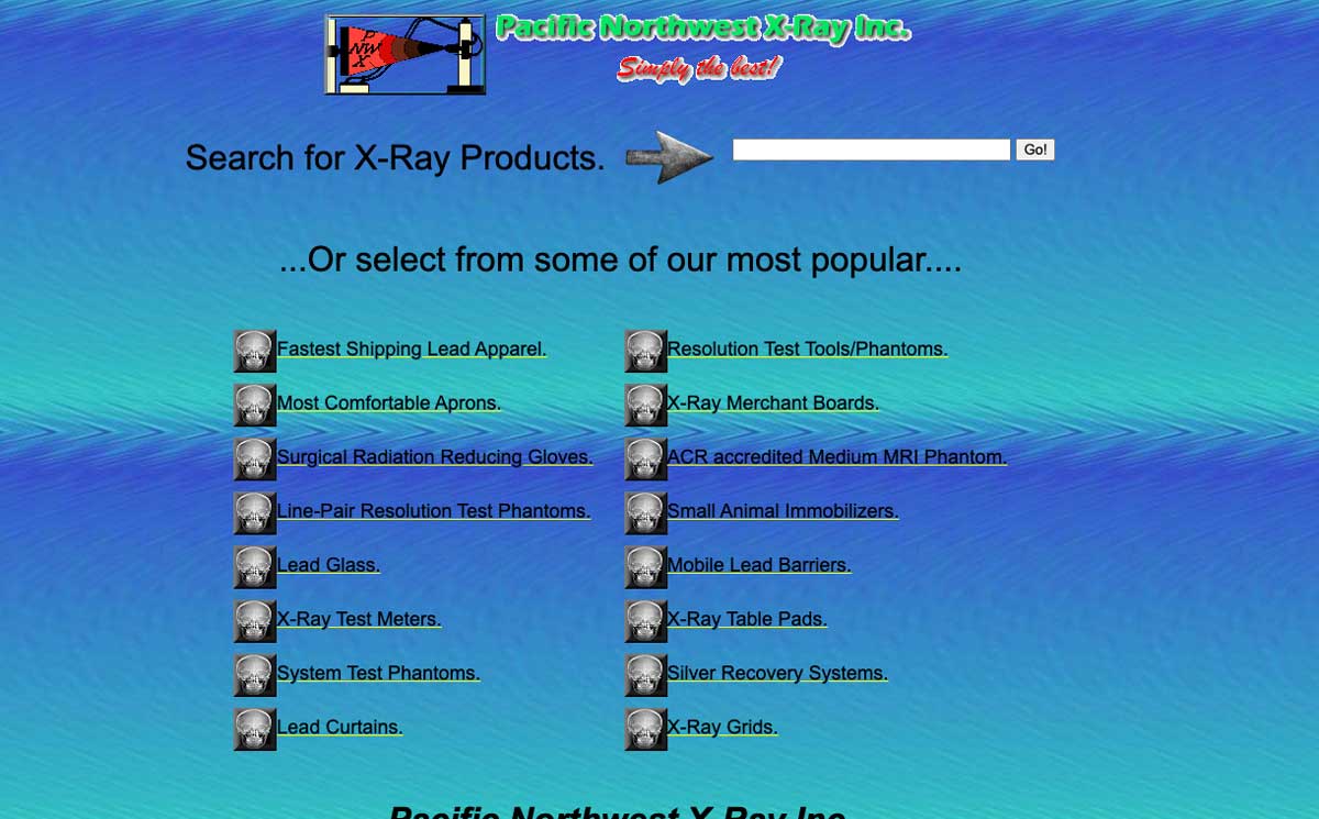
That said, templated websites are better than nothing. That said, if you want to stand out and beat your competitors, hiring a web designer is better.
Here’s more:
The layout is also critical for conversion optimization, even more so than the design itself. The layout is basically how the elements are arranged on the website.
Now:
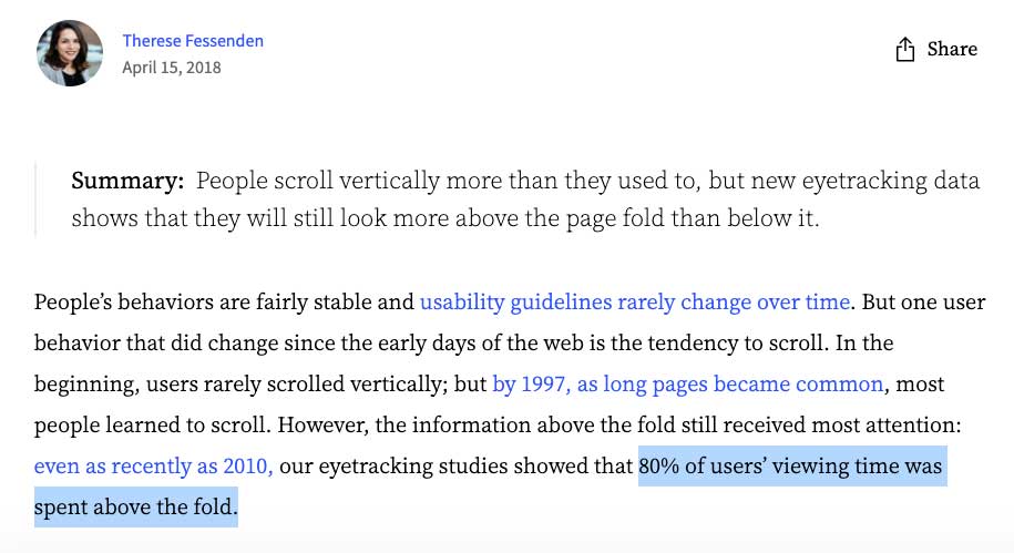
The most important part of your homepage is the “above-the-fold” area—essentially, the very first thing users see when they visit your website.
According to the NN group, 80% of users’ viewing time will be spent on this section.
So, let’s focus on that.
First, you should limit the items on the navigation bar and only give one main call to action above the fold. A secondary action could also be included, but it’s definitely not recommended.
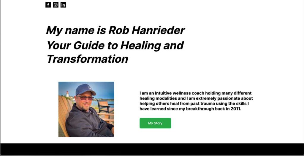
Before:

After:

You see, there’s this concept called analysis paralysis. If a consumer is presented with multiple options, they’re more likely to take no action than if presented with fewer options.
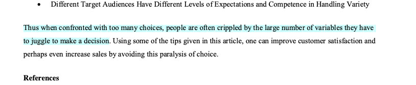
In short, your navbar should have at most three items for navigation and one main action, such as your primary service, a login or sign-up link, or a search bar for e-commerce.
But only ONE main action button.
And yes, your social media links shouldn’t be on your navbar unless your goal is to gain followers, which is usually not true for most businesses.
Next, the layout of your hero section. This is the area after the navbar.

Moreover, this is the most common layout for hero sections, and for good reason—it works.
Most people read from left to right, so we’re wired to look left first when visiting a website. The point is that all your important elements should be on the left side, while the right should support these elements—usually a hero image.
Now:
What’s “important” may depend on your industry. For instance, a photography portfolio would benefit from showcasing their work in the hero section.
Your value proposition, call to action, and some social proof are essential for my client and most businesses.
So, you need copywriting for your value proposition that encourages your prospect to take the next action.
Pro tip: Your call to action should use first-person language, start with a verb, and add some urgency, scarcity, or an incentive. For example, “Book ‘my’ FREE call now.”
Please do NOT use fake urgency or scarcity like “5 spots left” when there are actually unlimited spots. This can damage your relationship with your customers or clients, causing them to lose trust. So, say goodbye to your long-term goals.
Also, your call to action button should be dominant, with large and bolded text and eye-catching colour.
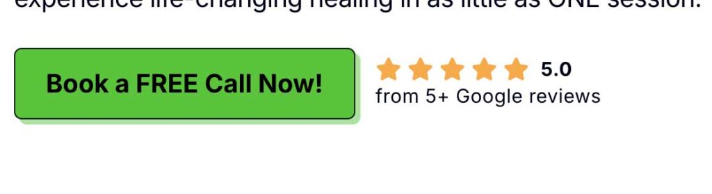
You should add a mini social proof element above the fold where it makes sense. This could be your Google reviews or some stats about your business. This builds trust quickly with new prospects because they’ll know you’re a credible business. Then, you can show the long-form testimonials below the fold.
Here’s the before:

And after:
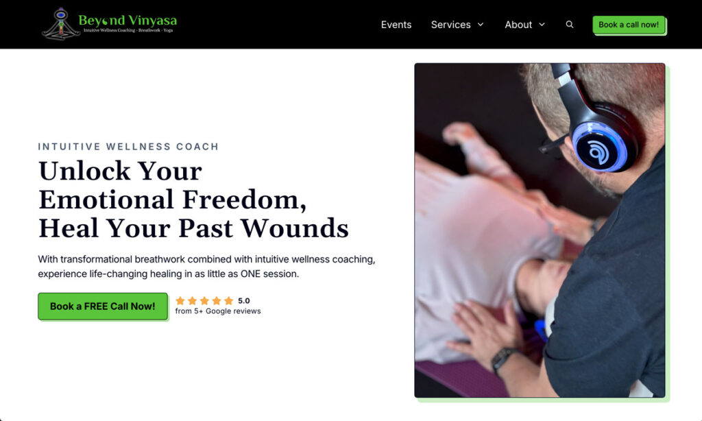
To be fair, the colour scheme and typeface are the same as the original. I simply added a bit of flair to make it look professional, like the shadow offsets, borders, and a simple animated button. And yes, the copywriting and layout follow the best practices for better conversion.
If you want to maximize conversions, switch to a premium website tailored to your business.
Book my Meeting Today!Save Time & Effort
One other problem was the time-consuming aspect of event management, which involved handling registrations and payments, signing waivers, and sending reminders.
To fix this, I implemented a built-in booking form where users can pay and sign waivers online. So, say goodbye to paper stacks! Reminders are also sent automatically, saving the hassle of manually searching for and sending emails one by one.
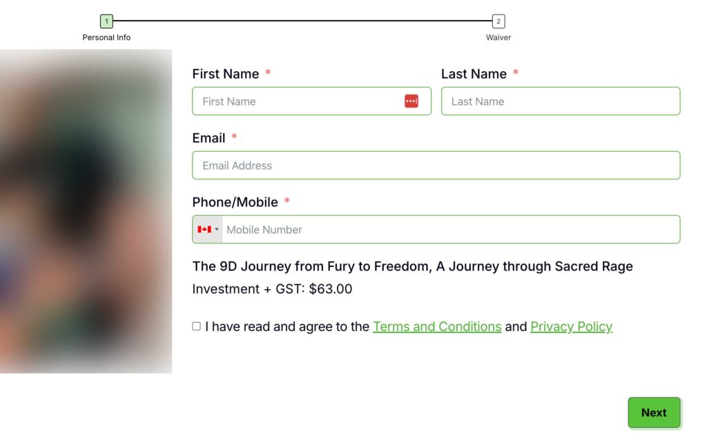
By doing this, I managed to save over ten hours of his time each month, assuming he has 10 events per month.
I also made sure he could easily manage the website on his own, like updating text or images. To facilitate this, I implemented several custom features and created a personalized tutorial for his new site.
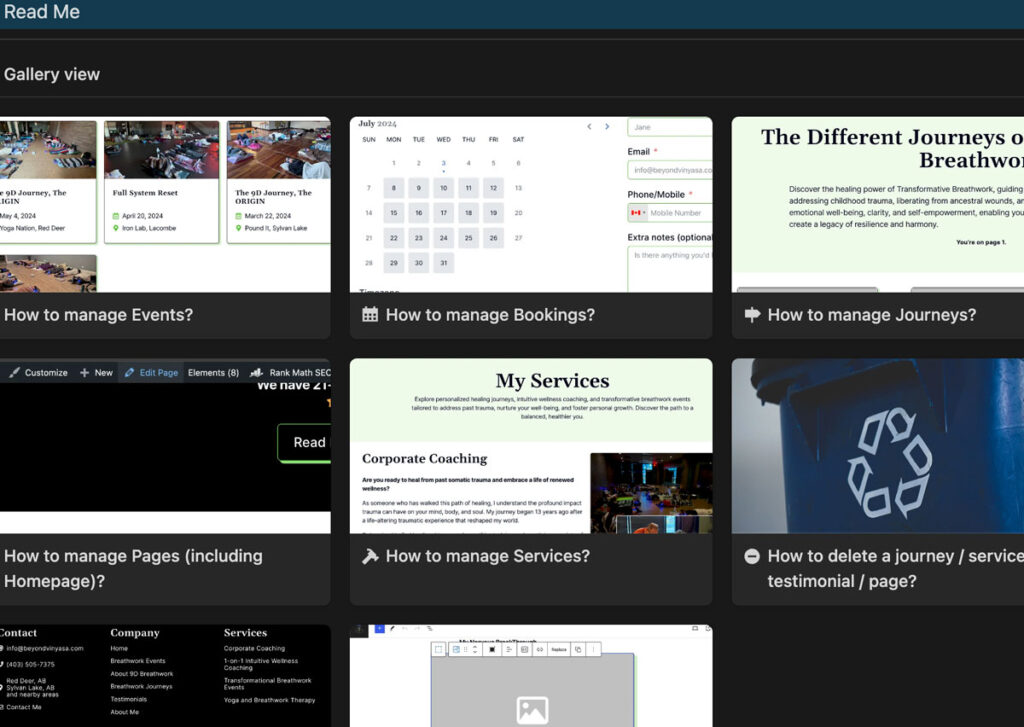
For instance:
- If he adds a new service, it will automatically appear in the navbar and footer.
- Testimonials are now linked to their respective services, displaying only where relevant.
- Social media links are centralized, so they only need to be updated on one page, eliminating the hassle of manual updates across multiple pages. Previously, each page required separate edits, cumbersome and prone to errors.
Alright, let’s move on to the last one.
How to speed up the website?
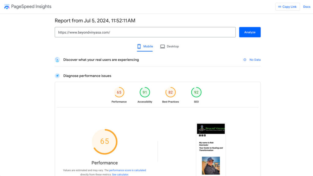
Another major issue that impacts SEO and conversion is the website’s speed. According to PageSpeed Insights, the site was in the orange zone.
So, let’s revisit the topic we put a pin in earlier.
This is the main reason why WordPress is still much better—you can easily speed up your website.
Achieving this is either not possible or ridiculously challenging with most website builders.
For instance, I considered switching to Wix because it uses React and is a single-page application (SPA). This means it works like a mobile app, updating content instantly without reloading the whole page. It’s essentially a modern Web App.
However, at the time of writing, it’s practically impossible to reach a score of 90+ in PageSpeed Insights with Wix. If they used a Static Site Generation (SSG) like Next.js, it could be possible.
But enough with the nerdy stuff.
With WordPress, ensuring your website is fast is much simpler! You generally need two things, and you do not need coding skills.
1. Perfmatters Plugin:
Perfmatters provides full documentation on which settings to toggle to speed up your website. Yes, it’s as simple as turning things on or off—no need to code. (I’ll probably create a full tutorial for this, so stay tuned!)
2. Cloudways Hosting:
I’ve been a long-time Cloudways user. I actually moved away from them but ended up coming back because their servers are fast, support is excellent, and managing several applications is a breeze.
Moreover, Cloudflare, a third-party integration in Cloudways, AUTOMATICALLY optimizes your images, which is a game-changer coz for website builders, you usually have to MANUALLY optimize the images. Although, it’s still not ideal to upload 4K images unless you’re showcasing a design.
and enjoy 20% OFF on your first month if you use the code, “LUX” on your checkout.
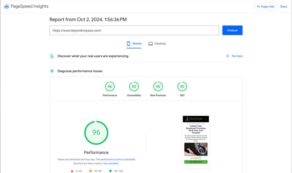
So, if your website is hosted on Cloudways, uses a CDN, and Perfmatters is correctly set up, this will be the result:’
With all these efforts and after waiting, I was able to rank his website as the #1 result on his branded search.
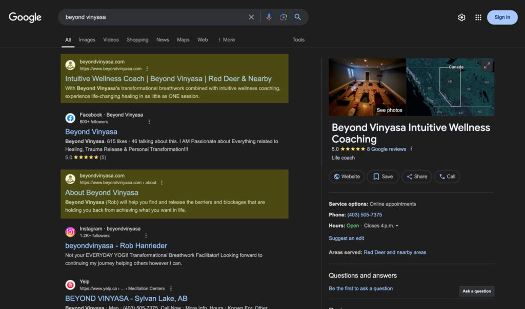
As a bonus, all the search results of the branded search lead to his business, which wasn’t the case.
Let me give you a quick task: Search your business in Google (incognito) and see if your website is the first result. If not, you need to do some work; otherwise, people searching for your business might not trust you.
Conclusion
In summary, these are the main results of the project:
- Now ranking #1 for branded search
- PageSpeed Insights all green
- Save time and effort